HI,
I am using Articles Anywhere from Regular labs, with that tool I can set up a blog with ordering based on Joomla fields.
The blog contains 3 articles next to each other and that stays that way when a change the browser size. I want to limit the article-blog to one article per line when I reduce the browser size for smartphone.
This is the coding (Articles Anywhere) I use in my Joomla article:
<div class="row-fluid">
<div> </div>
<div>{article Home }</div>
<div>[text]<br />{/article}</div>
<p>{articles category="Activiteiten" datum=">date('today')" ordering="datum ASC" per_page="3" }</p>
<p>{if first}</p>
<div class="grid-3">
<p>{/if}</p>
<div class="panel">
<h4>[title]</h4>
<p>[image-1]</p>
<h4>[category]</h4>
<h4>[datum format="j F Y"]</h4>
<p>[readmore]</p>
</div>
<p>{if last}</p>
</div>
<p>{/if}</p>
<p>{/articles}</p>
<p> </p>
</div>
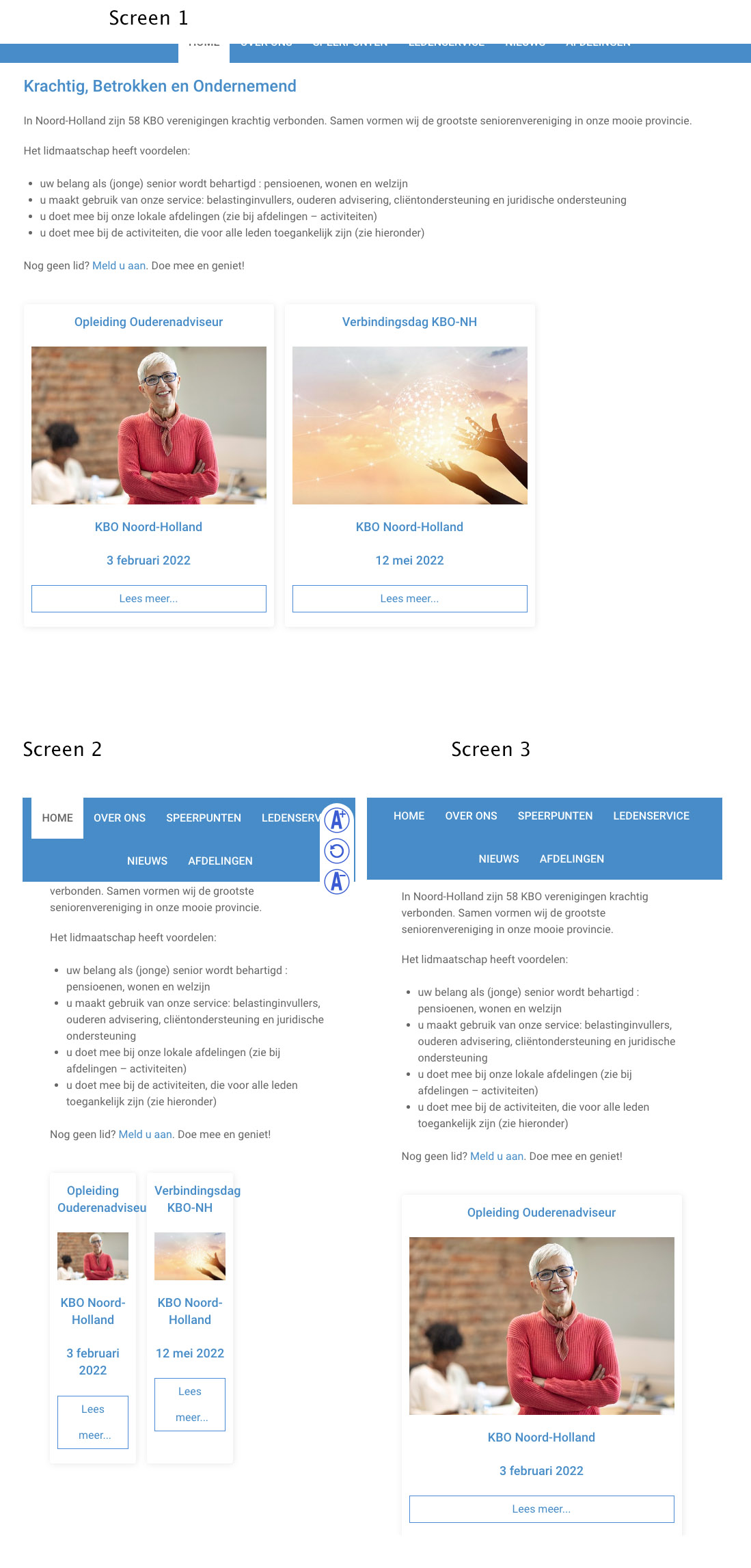
See screendumps:
screen 1: my full page browser
screen 2: shrinked browser with non responsive articles
screen 3: This is how I want the smartphone layout to be.
Can anybody help me with this?
Thanks, Arno.