I'm working on a modified Antimatter theme.
I had a modular template made for antimatter that rendered content in 3 columns in desktop, displaying the content in a single column on mobile devices.
Now I would like to create a modular template where I have 5 or 6 columns, rendering also as a one column on mobile. The problem is that the 5 columns stays 5 columns on mobile devices.
What and where do I have to add to the site in order to display the 5 columns also as one column on mobile?
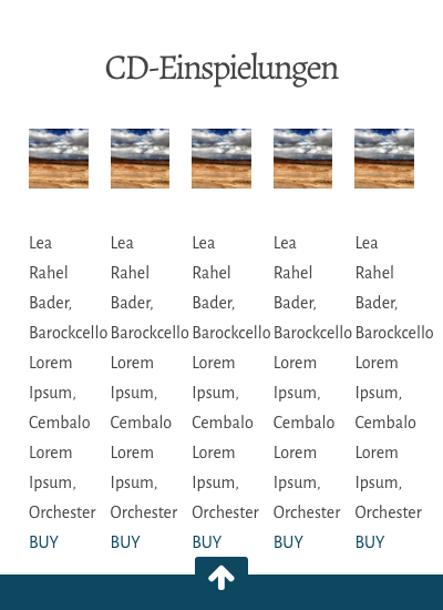
See screenshot for actual mobile rendering of the 5 column template. Any help very much appreciated!