Skip to content
Grav 2.0 is officially stable. Read the announcement →

Community guidelines

Please keep discussions civil and on-topic. Repeated violations may lead to a temporary ban.

Themes & Styling

Fixed sidebar in sections

Started by matteo 7 years ago · 7 replies · 1825 views
7 years ago

Hi guys,

I'm very new to Grav, so maybe the question can sound trivial.

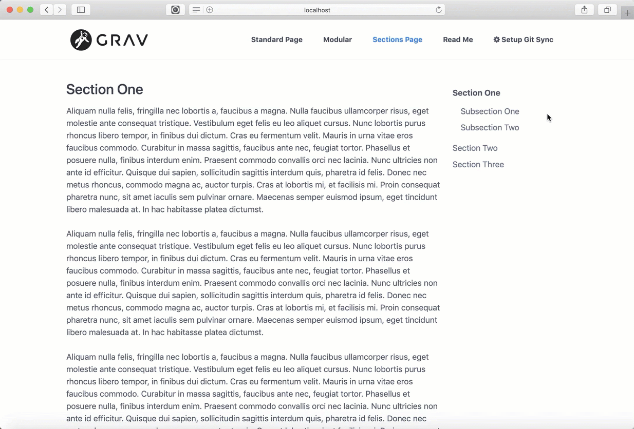
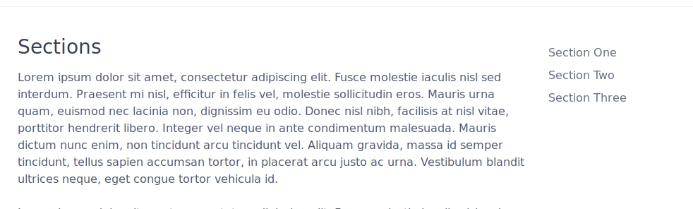
I'm exploring the quark-open-publishing theme and I was wondering if it is possible to have a fixed sidebar in Sections. That is, in the following picture, having the right sidebar that follows the page scrolling:

Selection_029|690x207

Thanks for any hint

Cheers

Matteo

7 years ago

Hi @ghtmtt, I am the author of the Quark Open Publishing Theme and I don't know how to do that myself but perhaps someone else here might via CSS or re-working the Twig🙂

UPDATE: Well, lo and behold the SpectreCSS framework has a class that makes an element fixed! Here is a demo video:

2019-02-12_10-23-13%20(1)|690x467

Let me look into things more and see if I can add this as an option to my next Theme update.

I used SpectreCSS columns and nav element for the sidebar if that helps:
https://github.com/hibbitts-design/grav-theme-quark-open-publishing/blob/master/templates/sections.html.twig#L80-L123

last edited 02/12/19 by Paul Hibbitts
7 years ago

Hi @paulhibbitts, first, awesome theme, really. The more I dig into it and the more I love it 🙂

I don't get how you fixed it in your video. Have you changed something into the sections.html.twig template?

👍 1
7 years ago

Thanks @ghtmtt - Quark does all the heavy lifting🙂

I've been able to fix the position of the Sections navbar by adding the p-fixed class to the element, so line 82 in template files sections.html.twig is changed to <ul class="nav p-fixed">

However, if the Browser window is shrunk the Section navbar disappears with this approach - not sure why yet. I will keep looking into it, and like I said someone with more CSS/Twig experience might have an idea here too.

7 years ago

Awesome, thanks! Should I leave this open for the Browser shrinking/disappearing?

Again, awesome!

👍 1
7 years ago

Let's leave it open for now - perhaps someone with more experience with SpectreCSS might chip in about how to have the fixed nav element move to the bottom of the screen on smaller screens.

7 years ago

perfect, thanks for your help

6 years ago

Thanks for the help, p-fixed was exactly what I was looking for! Doesn't look like this has progressed any further, so I'll chip in.

I'm using the Quark theme in Grav. Rather than try to fix the broken responsive sidebar relocation with p-fixed (actually I took a look but gave up due to time constraints) I simply duplicated the sidebar in my footer. Then used Spectre's show-md/hide-md to show/hide the version that I wanted depending on the page width, which keeps the responsive design intact.

So a workaround not a fix, but it's serving me well enough.

Suggested topics

Topic Participants Replies Views Activity
Themes & Styling · by Pedro M, 2 months ago
4 198 2 months ago
Themes & Styling · by Ian, 2 months ago
3 94 2 months ago
Themes & Styling · by Norbert, 2 years ago
11 455 3 months ago
Themes & Styling · by Lukáš Findeis, 3 months ago
0 48 3 months ago
Themes & Styling · by Sebadamus, 4 months ago
5 128 3 months ago