@oxide, OK, you can partly blame me...
LOL... You included the comments from my example, which is invalid css. Remove the // and the remarks
I will fix my example code...
And you can blame yourself...
You are using plugin lazysizes which automagically replaces the original <img> definition into an <img> using a srcset. When using the following inside your markdown:

which normally generates:
<img alt="" class="portrait" src="/user/pages/02.typography/portrait.jpg">
but lazysizes generates (using default settings):
<img alt="" class="portrait lazyautosizes lazyloaded"
  data-srcset="/images/5/3/d/4/f/53d4f267887a440cf8cc6c69aa8fe01099653869-portrait400w.jpeg 400w,
               /user/pages/02.typography/portrait.jpg 719w"
  data-src="/user/pages/02.typography/portrait.jpg"
  data-sizes="auto" sizes="976px"
  srcset="/images/5/3/d/4/f/53d4f267887a440cf8cc6c69aa8fe01099653869-portrait400w.jpeg 400w,
          /user/pages/02.typography/portrait.jpg 719w"
  src="/user/pages/02.typography/portrait.jpg">
What's the effect of lazysizes?
- It turns your images in so-called responsive images, which means that for specific window sizes, other images are being loaded. Smaller window, smaller images...
This is good for the speed of your site.
- It loads the images lazy, which can be useful when using large sets of images in for example galleries or masonry.
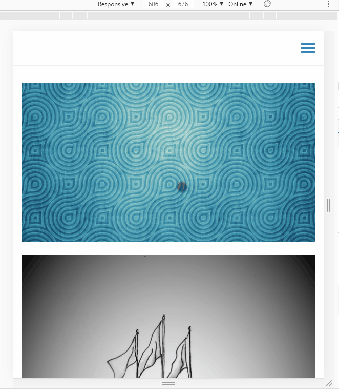
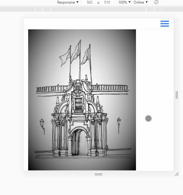
- Lazysizes problem: I think lazysizes introduces an issue when enlarging the window: The images do no longer enlarge when enlarging the window.
This is why your are experiencing weird resizing behaviour.
- Luckily, people do not resize their window to surf your website. So the issue will not be noticed by visitors.
- So, while testing, disable lazysizes.
- Btw. Grav has build in functionality to create responsive images. However, they are not loaded lazily as lazysizes does...
Another issue:
I'm afraid all of this is way out of your comfortzone.... 😇